
A comprehensive mobile application that combines AI with health management to help manage and monitor a person’s health condition

Caspia Health


The cloud-based application will automatically organize and analyze the health data such as symptoms, health records, doctor's notes, etc. once it is entered. The patented smart search algorithm then enables to quickly find the relevant health information and share it with the user and their loved ones.
MY ROLE
Lead and solo Designer – Discovery, user research, design and prototyping, Usability/Functionality Testing
YEAR
2020 - Current
TOOLS
Adobe XD, Invision, Sketch, Adobe Photoshop
PROBLEM
In addition to tracking symptoms, patients are forced to remember medical information during consultations and remain aware of symptoms when afflicted with illness. There was a lot of complex information that was discussed quickly and aptly. It is therefore essential to record and transcribe doctor visits for sharing securely with family and friends during complex care scenarios such as cancer, Covid-19 etc.

Remembering information Medical Stats convey that patients remember only 10% of the content of their doctor's appointment by the next day and doctors speak at about 130 words per minute. Further, doctor’s conversation can be stressful and overwhelming, especially during a serious medical situation, making it difficult to accurately remember everything discussed. Having a recording of what the doctor said can help patients better retain important information, gain a better understanding of options, and make the best decisions possible.
Symptom Tracking Many patients with a chronic illness like cancer or victim of pandemics like COVID-19, struggle to manage symptoms during treatment. These patients have to contend with a variety of symptoms at home—issues stemming from the ailment progression, treatment regimens, and co-morbidities—and many rely on clinic visits to get help with managing these symptoms.
Remote tracking Helping the loved ones keep track of the health information and manage their health issues remotely especially during the pandemic times

Current
Workarounds
Track the health symptoms on the go
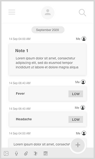
Symptom Tracker
A patient may record as many symptoms as needed, set the time the flare-up occurred, and post to the symptom tracker quickly.
More details can be added to the automatically generated note and the trends can be visualized over time.
Additionally, it also helps the care provider make more informed decisions about the patient’s diagnosis and treatment based on the symptom log.
Key Features


Easily search through the recorded data
Smart Search
With built-in filters this app exclusively has the ability to search through the data to retrieve the results needed in short span of time.
The right note or image can be found right away with powerful search and keyword tags.
The notes can be synced with all the devices such as phone, tablet, laptop so that they are accessible from anywhere.
Ease of remembering by taking notes and faster access
Note Taking
This app can be used to add multimedia information, such as audio(auto-transcribed), images and attachments in addition to simple text notes.
Everything stays neatly organized in the application, including appointment recordings, transcripts, post-appointment group chats, and even plans for the next appointment.
Push notifications are available for medications, track symptoms, appointments, especially televisits or whatever reminders the patient/caregiver have marked
Easily search through the recorded data
Shared Data
Trusted people are granted different levels of access to the patient’s health data. A dependent’s note can be co-owned with a care-giver. Individual messages and access can be controlled by locking and unlocking action
Everyone the user chooses to include are connected and informed at every step, automatically.


Private Health Record for reference
Profile Data
A patient can use it to record most of the health-related data to show to the first responders during emergency.
The user can add their medical insurance cards, medications & supplements, therapies, procedures, allergies to populate their health profile.
They can even set the details about the healthcare team that manages their health like physician, RN and family members to keep them in the loop of healthcare


GOAL
Optimize the patient-care provider scenario to reduce the cumbersome note taking activity during evolving medical situation

OUTCOME
Accurate prediction of a user's health and wellbeing.
In addition, the target users would learn more about preventing or progression of the disease as opposed to only treating it.
Ensure coordination of vital health information and distribution of contents between healthcare providers which will allow the patients to reach more effective treatment solutions by better communicating with the specialists treating them.

Design Process

RESEARCH
An extensive study of the paper “Probing the benefits of real-time tracking during cancer care” provided us a full-fledged motive to proceed with the project to help the cancer patients to track their symptoms. As shown by the study,
01
The tracking behaviours of patients without a tool was sporadic and fragmented, whereas those with a tool were more consistent.
Tracked data also allowed participants to see patterns among their symptoms, feel psychologically comfortable, and improve their communication with clinicians.
Originally, Our team did a case study with a set of members who were suffering from breast cancer. They had a variety of items to be tracked including symptoms from chemo chemotherapy infusions, surgeries, radiation treatments, and follow-up appointments.
We carefully observed their methods of tracking symptoms, ailment progression, medication reminders, communication with their health care providers and with data collected from direct interviews & Questionnaires from the patient, care-giver and health care provider, we were able to brainstorm crucial pain points and get started with addressing the scope and constraints of the project.
We analysed few competitive applications in the medical space which helped us define what we wanted to visualize in the final output.
Target Users

We identified three variants of user communities for whom the application would be of great benefit to different degrees


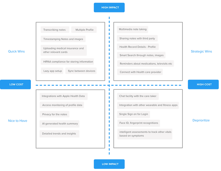
User Stories
Based on different perspectives of our target users, we classified the user stories. Features were categorized based on business impact and cost. We then structured the MVP based on these values.
Constraints
The MVP of the application was limited only to an exclusive set of user community suffering from a single ailment (breast cancer). Hence the symptom tracker recognizes only few symptoms to track with access to only few insights into the trends. Further, privilege restrictions are only addressed to one caregiver for the initial release. Hence limited scalability is one of the constraints which will be addressed in the subsequent releases.
02
Competitive
Analysis

There were many applications available which the users currently use to track symptoms. Some of the apps were restricted only to iOS and were not available for the android users. There were apps which were designed exclusive to one chronic ailment such as cancer or depression and other apps which were generalized to different long-term/short-term ailments.
The aim of our application was to integrate both the Note-taking and symptom tracking abilities to develop a better application suited to help track any ailment while keeping the loved ones informed of the treatment/disease progression and to step up in case of emergency.
03
App Workflow

Feature
Set
There was an extensive list of features and since we had a fixed deadline and technical constraints, the main challenge was to restrict the MVP to Major features.
The Feature impact matrix helped us to categorize the features based on the impact and business value. We documented the features to be developed for the subsequent releases
04

DESIGN
Once we brainstormed and consolidated the requirements, Our team collaborated to sketch the initial screens. We took inspiration from the top note-taking applications available and are widely used by the users such as Evernote, Google Keep, Native Notes app, so that the users are familiar with the usability and the transition from their traditional note-taking to caspia health app is seamless with a shallow learning curve.
From the initial sketches, we stepped up to decide the color palette and the parameters of the styleguide parallelly. We brainstormed different workflow paths and designed the UI accordingly. Since there was lot of data involved in this application, the design decision was based on the fact that we concentrate on recognition rather than recall to make it easier for the target users going through lot in terms of psychological impact
Sketches were then translated to med-fi and then to high-fi mockups. We had to keep the design minimal yet not losing focus of the main features. Paper prototyping helped us refine the flows and cover all possible paths before we headed into high level prototypes and development.
Moodboard &
Branding
SETTING THE COLOR TONE
Colors in this medical based application must be informative, but also soothing and calming since there will be an overload of text. It must be lucid and not distracting to the eye.
We decided to use the traditional and time tested choice of palette often used by healthcare providers – Blue & White. Typically, the color blue signifies credibility, trust, knowledge, power, professionalism, cleanliness, calm, and focus.
Specifically, Light blue color symbolizes trust and healing in the same way that water and sky do. Color white is said to boost the brain's performance since it implies healing and absence of clutter. Since many consumers already associate blue and white palette for medical apps, We went for the obvious without any ado.


Wireframes
Landing page

Point on Body

Dashboard

Add a Note
Symptom Tracking
Symptom Recording
Medical Profile

Smart Search

Health Profile
Sharing Notes

Add Symptom
Symptom Recording
Medical Record
Symptom to Homepage

Smart Search


Prototype

DEVELOPMENT, RELEASE & TESTING
Beta testing of the app was released on the test flight environment to experiment with the study group of members suffering from breast cancer and their caregivers. The app was also showcased to researchers at Yale University to get feedback. For the next focus group of study, we would like to examine the needs of the transplant community for future app modifications.
All the features are available to users for free and the premium plans are planned to only focus on the storage criteria without compromising the features.
DESIGN FEEDBACK
Some of the design feedback we received were
Feedback The Timeline of notes on the landing page would be overcrowded with a lot of entries.
Solution Entries organized according to calendar date – only recent few entries are shown
Feedback The idea of a timeline might include medical pictures which might be sore to the caregiver/patient’s eyes. Hence a consolidated list of features could be present on the landing page rather than starting with note-taking action
Solution Instead of having a list of notes and timestamped entries, we cut the idea of timeline and added notes into a separate section not visible to users on the landing page
Feedback Note-taking as an obvious feature of the app undermines the symptom tracking functionality.

Solution Equal priority and placement given to features in the re-design
Feedback Tracking recent symptoms require 2 clicks
Symptom tracker --> Record symptoms
Solution The recent symptoms to be tracked are listed on the homepage so that the user can record the symptoms on the go with one click
Feedback Long list of stacked items under user profile, which makes it tedious for the users to access and also requires multiple scrolling action
Solution Stacked design changed to tabbed design so that the users can access the information with ease
Feedback Search action by one keyword should let the user select particular category instead of a general display of all entries
Solution Filters in search help the user to select a particular category and search the entries in the particular category
05
LEARNING
Caspia Health Application was the first project I started with in medical space. I was fortunate to own the problem, lead the project and with the help of the team, drive the solution to launch. As the Lead Designer, I participated actively in User Research, Requirement Analysis, iterative Design and usability testing . This was crucial project considering the focus group we dealt with. Patients with chronic illness deal with a variety of symptoms at home, exacerbated by treatment regimens, cancer progression, and co-morbidities. Hence their time was very critical when it comes to research and to deliver a, User-friendly application to manage their health information was the key goal. I had the opportunity to work with researchers, doctors who were in direct contact with the patients and had seen them struggle with data management.

Keep the design minimal
Constraint on the app development was also that the application must be suitable to wider demographics and people with limited technological capabilities. Hence the application must have a shallow learning curve and obvious features. So over-crowding the application with “nice-to-have but might be complex to learn” features was a big No-No.
Empathy is the Key
Seeing the world from the shoes of the target users gave a new perspective for design. It defined the context and scope of the project. I learned that the extent to which I understand and empathize with the user's modes the UI in a way that is usable to the end-user
Data Organization is vital in designing medical App interfaces
To give the ability to filter useful information from a huge load of unwanted data is very critical when it comes to health-related data. Users want to scan different notes, imagery, symptoms in a short time and need to derive the outcome. When it comes to handling chronic illness, the mind of the user will always be stressed to handle a long list of data. Hence proper organization soothes the mind.
06
ENHANCEMENT
Some of the long-term enhancements which we planned for future releases of the application are
Calendar Integration
Adding appointments of the patient and syncing them with the native calendar in the future versions will make sure that the user is aware of the schedules and plans ahead of time.
Privacy Privilege Access
Restraining the access privileges for creating, editing to one or more of the third-party members would make the owner of the app be in control over who should access the particular items of the record.
Integration with Wearable Apps
Integrating Caspia Health with other wearable apps such as apple watch, fitness bands will keep the patient ahead of recording a few parameters and also keep track of the vitals before entering the data manually
Expansion into different platforms
Right now, the application is designed only for iphone users. The future versions would be made available on Android, Apple watch, tablet platforms to create a smart ecosystem