
Costco App Re-Design
A team project to re-design the popular Wholesale shopping app to increase user engagement and downloads
Wireframing
Prototyping
User Journey
Styleguide
The second-largest Wholesale Retailer
MEMBERSHIP BASED WAREHOUSE
Costco is a wholesale store based in Seattle, WA. They are based on the revenue generated by the membership fees and are the second-largest retailer next only to Walmart. Their main goal is to keep the costs low and promote savings to the consumers without compromising on the quality.
MEMBERSHIP RENEWAL & RETENTION
Nearly 44 million households hold a membership with this club and 91% of these people renew their memberships annually. Costco has a loyal consumer base and it is essential for the retail giant to offer a seamless shopping experience in-store and off-store.
THE FLAWED APP AND THE DESIGN GOAL
Costco App rolled out in 2017 and it made shopping online easier. It allowed members to access the other features of Costco such as Pharmacy and Travel services through the app. Unfortunately, The app does not serve the purpose of good user engagement and has a poor rating of roughly 3 stars and hence giving us an avenue for redesign.

Discover Phase - User Research
TARGET USERS OF THE APP

2+ Member
Household

Small Business
owners

Affluent
Households

Educated
People
VOICE OF THE USERS
We Researched a sizable number of users who are frequent members of Costco and some of them have an app installed on their smartphones.
-
Most people don’t use the app frequently and would rather like to go directly to the store for purchase.
-
⅓ (30%) used the app to access the Photo Center
-
Majority (70%) don’t use the app since its more of a website dependent setup
-
100% prefer in-store purchases.
-
100% feel that they might use the app if they are able to find out whether an item exists in the warehouse before they start off to Costco.
-
70% feel that they need a way to access the membership card via their smartphone or smartwatch.
DEMOGRAPHICS OF THE USAGE
Before we jump to the redesign of the app, we also collected enough numbers about the demographics of the users and the pattern of spending to influence the current and future buildup of the App

From the source provided by InfoScout, We feel that People above the age group of 50+ are frequent visitors and hence Accessibility factor has to be taken into consideration during the Re-design
Also, the study reveals that the basket size is larger and hence to make the shopping experience easier, it must be easy to search and find items.


"We believe that by improving the digital experience for the shoppers we will increase the convenience of buying. We will know this to be true when we see an increase in the app downloads”
GOAL QUESTIONS
How might we make the shoppers aware of the items available in the warehouse nearby their location?

How might we make the shoppers using the app be less dependent on the web?

How might we make the shopping experience less cumbersome?

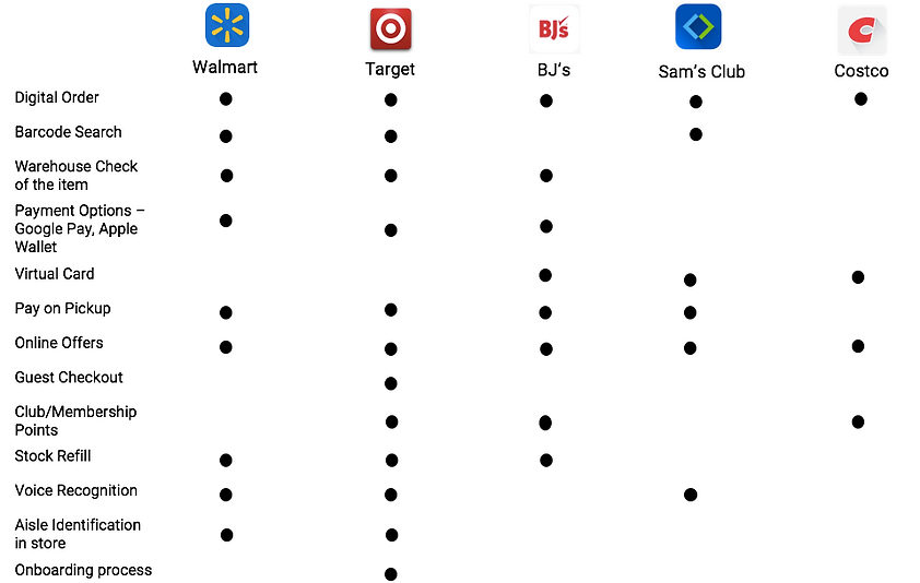
Competitive Analysis of other Retail Apps
Define Phase - Problem + Solution
SYNTHESIZING THE DATA
Although there are notable features which needed to be redesigned in the app and many paths which a user may progress through the course of interaction with the app, We specifically covered the popular flow - Item Search & Purchase. Our workflow following will be mainly to provide a seamless shopping experience for the consumer.
PROBLEM OF THE PATH
We have observed that the time taken for a person to complete the task from looking to purchase an item to the actual purchase takes a longer time when compared with other retailer apps and also the error rate to search a particular item is higher and by improvising the design, the task completion rate + Error rate can be minimized
PROPOSED SOLUTION
1) Changes in Styleguide
2) Changes to the displayed details
3) Changes to the tasks done along the path of the purchase
4) Changes required to the navigation.
5) Changes to the Search process
User Personas

User Journey Map

User Journeys/Possible Paths
POSSIBLE PATHS IN THE APP
We identified the different major user flows which the user might take to accomplish an end goal using the app. We restricted the scope of the app to the purchase flow.
SEARCHING & PURCHASING A BASIC ITEM WITH A PLAN
-
The User wants to purchase an item from Costco.
-
He downloads the app to check for the item availability
-
He clicks on the item.
-
The UI shows the item, available stock, Warehouses available.
-
The User purchases the item
REFILLING MEDICINES - PHARMACY
-
User opens Costco app
-
Clicks on “more” tab and continues to the Pharmacy tab
-
User enters info about the prescription and enters contact information
-
User receives an eta for when the prescription will be ready
-
User receives a notification that the prescription is ready to be picked up
VIRTUAL MEMBERSHIP CARD + APPLE PAY
-
User arrives at Costco to purchase an item
-
He forgets his wallet at home
-
User has Costco App downloaded
-
He uses the app to show his membership card during entry
-
User makes a purchase at Costco.
-
The user uses the Apple Pay Associated with his account to complete the purchase
PURCHASING AN ITEM- WITHOUT PLAN
-
The user wants to purchase a gift.
-
He wants to know about different options and offers.
-
User downloads the Costco App.
-
User sees a list of offers and recommendations available
-
He selects a product which was on offer for Costco members
-
He sees the specifications of the product.
-
Add to the cart and Makes the purchase.
-
The user is happy that the item will arrive just in time

Story Board

Develop Phase - Solution Elaborated
IMPROVEMENT IN THE CURRENT NAVIGATION
-
Photo Center is the most used feature - hidden in level 2 of navigation
-
pharmacy Refill is the next most used feature - hidden in level 2
-
Membership Option is scattered in different places of navigation
-
Pet Supplies category is down by another level
-
New items are a scattered Category
-
Warehouses are shown as a part of primary navigation
-
Renaming of certain nomenclature might change the user's perception. eg: SHOP in Primary navigation, LISTS in sub-navigation
-
Help and Documentation is hidden from users and not accessible
-
Categories are not well organized and bring a sense of confusion as 3 or more items are thrown as one.
-
Few navigation items are not necessary - All View More Categories
OLD SITEMAP

NEW SITEMAP

Paper Sketches for the Interfaces


Low- Fidelity Wireframes for New Design


HOMEPAGE


SEARCH RESULTS
ITEM DETAILS PAGE
MEMBERSHIP PAGE
Renewed Styleguide
