
Evernote App Re-Design
A project centered around the re-design of a popular note-taking application by analyzing the interfaces and identifying the drawbacks
Wireframing
Pain Point Analysis
Prototyping
SaaS
Real Problem of Note-Taking Unleashed
WHAT IS EVERNOTE
A cross-platform Application developed for Note-Taking and Task Organization.
WHY REDESIGN EVERNOTE
Certain Pain points exist among users while using this app for rapid Note-taking. Users had to go through a specific process which makes navigation difficult and also increases the time to complete the action.
THE FINAL GOAL
Making the note-taking process convenient and to reduce the time taken to create a note.
All Set for the New Design
MY CONTRIBUTION
Analysis of the Workflow and comparison with other Competitive apps.
Designed Wireframes of different fidelities and prototyped a refined Mock-up
Performed an Usability Study of the new Interface using different parameters and compared with the former one.
THE DESIGN PROCESS
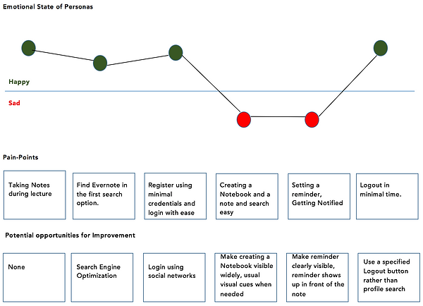
1. Identifying Pain-Points - User Research
2. Analyzing the Existing interface
3. Sketching Low-Fidelity Mocks
4. High-Fidelity Prototyping
EXISTING INTERFACE

5. Usability Testing of the new Design
The Voice of a Real User
" Evernote is my go-to app for my everyday lectures. But the need to create a Notebook first to store notes is a kind of laid back on User Experience "
- Anna Maria, Grad Student
Studying User Empathy through Maps

A TYPICAL PERSONA EXAMPLE
A student who has to take sufficient notes during lectures and hence the requires quick organization of notes and also find the required material immediately upon minimal search.
ALL THE GOOD THAT EXISTS
Lot of features are available to make
the notes as distinguishable as possible from other notes. The auto-save feature saves time and is a fail safe mthod
WE FOCUS ON THE FLAWS
It fails to capture the time expended on creating a Main Folder and then creating a note. The process requires three steps which cannot be excluded in the existing interface.
Diving into the detailed User Journey


Existing User flow of Evernote - Creating a Note
DRAWBACKS OF THE INTERFACE

Creating a New Notebook is not visually prominent and hence the main feature suffers a drawback.
To create a note, the user must first create a notebook which is not an ideal scenario when individual notes are needed.
The Notebooks are not visually distinguishable. The tagging option is hidden in the interface.
Redundant Trash icons which still does not simplify deletion.
Another redundancy phenomenon found in Notebook Sorting which accounts to a hazy interface.
Re-design Goals for the new Design
Creation of a Notebook and Note given the core feature prominence.
Introduction of a Drag-and-Drop feature to delete a note
Creation of Independent Notes which are not a child of any Notebook
Tagging Feature and Reminder for Notes made visible explicitly rather than hidden
Enabling Search through the list of Notes independently
Removing Redundant Functionalities such as Sorting Notebooks and Trash.
Visual Separation of Notes and Notebooks in order to differentiate the Name and Type

Creating Rough Interfaces using Balsamiq
CONTENTS OF THE NOTEBOOK SHOWN IN BRIEF
SHOW THE CONTENTS OF THE NOTEBOOK ON HOVER

MORE DETAILED APPROACH FOR THE CREATION OF A NEW NOTEBOOK
SHOW A NOTE HAS A REMINDER ON THE MAIN PAGE RATHER THAN BEING HIDDEN
The Changeover - High Fidelity Mockups
DESIGN IMPROVEMENT 1
CREATING A NEW NOTEBOOK - OLD
Creation of a new notebook involves typing in a new name and also select the type of visibility for the Notebook. This is the first step of the User flow
CREATING A NEW NOTEBOOK - REVAMPED
The Selection of Privacy is replaced by a brief description which is also made an optional feature. Hence only a name is required to create a notebook. The privacy option can be selected later if needed. Inherently set to private.
IMPACT OF THE CHANGE
This change reduces time to create a new note. Users tend to see the privacy option as an optional one whereas it is a mandatory feature of the existing app. A Description also helps to identify the purpose of the Notebook

OLD DESIGN

NEW DESIGN
DESIGN IMPROVEMENT 2
VIEWING NOTE INSIDE THE NOTEBOOK - OLD
Accessing a note inside a notebook is a 2-step process. The first Step is opening the notebook and the second step is searching through the list of notes
VIEWING NOTE INSIDE THE NOTEBOOK - NEW
One step process where the main Notebook opens into all the folder contents and the required note is selected from the same page.
IMPACT OF THE CHANGE
Simplification of the number of clicks required to achieve the process of finding a note amongst many notes & notebooks.

STEP 1 - CLICK ON THE REQUIRED NOTEBOOK


SIMPLIFIED - CLICK ON THE REQUIRED NOTEBOOK TO VIEW THE NOTES BEFORE OPENING THE NOTEBOOK
STEP 2 - SEARCH FOR THE REQUIRED NOTE IN THE GRID
DESIGN IMPROVEMENT 3
REDUNDANT TRASH FUNCTIONALITY - OLD
Deleting a note moves it to trash. The old design has two instances of trash shown along with the notes and also on the menu. This is a redundant option which requires a change.
REMOVING THE REDUNDANCY - NEW
Two instances are simplified into one option and placed on the menu rather than with the notes.
IMPACT OF THE CHANGE
The visibility of Trash in the menu along with the number of notes in the trash helps to access the bin throughout the flow of the process. Redundancy is avoided


DESIGN IMPROVEMENT 4
GROUPING FUNCTIONALITIES - OLD
Creation of a notebook has a definite visibility on the Homepage since a creation of a note is only possible through a creation of a notebook as the first step.
GROUPING FUNCTIONALITIES - NEW
Included both option of creating a Notebook and also an option for creating a Note in the selected Notebook from the list of Notebooks
IMPACT OF THE CHANGE
Creation of independent notes are possible in this approach avoiding the creation of a notebook as the first step. This change also simplifies the time taken to create a note inside a notebook by making options visible on the Homepage.

Embracing the Change by Usability Testing
THE USABILITY TEST
After prototyping the new interface using Proto.io, Users were asked to test the new application against the old application. The time to create a note in Evernote was assessed and It was found that users who used the new prototype found it easy to create a new note than the old application where the users have to first create a new notebook and then create a note.
PROOF IS IN THE RESULTS
Out of 5 users, the average time taken to create a new note in the existing interface was 38.4 seconds while creation of note in the new prototype required 16.2 seconds which is half the time taken by the old interface.
VISUALIZATION BY BARS

In a glance by Infographics
