
Social Network Art Competition (SNAC)
A project where I volunteered to design the B2B Dashboard and also revamp the B2C website to increase the user experience for Art submissions.
DashBoard
Wireframing
Development
Redesign
The Real Problem faced by the NPO
COMPETITION FOR ART SHOW
The Social Network Art Competition (SNAC-expo) helps in finding and promoting exceptional undiscovered artists, through curated online art competitions and exhibitions globally.
ARTISTS COMPETE FOR A COVETED PLACE
Artists from around the globe submit images of their artwork on the website to participate in a competition. Each art competition is voted upon democratically through social networks and then expertly curated by two curating boards. The winners are then announced and their artworks are sold online.
THE MAJOR GOAL
Making the process of submission on the website intuitive for the artists who are from different backgrounds and age groups.
Making the process of Review convenient for the Administrators and the panel members.
From Creation to Display - The Process
Artists create their profile on the website
Artists submit their artwork in a specific category
Voting of the artwork begins using the social platform
Best Artworks are selected based on the voting and displayed on the website
Interested buyers can buy the artwork from the shopping platforms
Diving in Depth into the Problem
MY CONTRIBUTION
Analysis of the existing layout along with suggestions for improvement keeping in mind the results collected from user research.
Wireframed and laid out visual mockups of the new site layout on B2B and B2C sides.
Proposed new Navigation Architecture for the website.
THE DESIGN PROCESS
1. UNDERSTANDING THE VOICE OF THE USER
Collecting Requirements & User Stories
4. WIREFRAMING THE INTERFACES
Transforming the sketches to Low-fidelity wireframes
2. ANALYZING THE SITE ARCHITECTURE -
Assessment of the existing navigation structure
Card sorting for the new IA
Proposing the new Navigation Architecture
5. LAYING OUT MOCKUPS
Defining the Styleguide
Creating High-Fidelity Screens
Checking the compliance with the reqs
3. ANALYZING THE EXISTING INTERFACES
Identifying the missing features and functionalitites
6. DEVELOPING THE INTERFACES
Understanding the voice of the User
DIGITAL GOALS
Enhance the look and feel of the website to meet the worldwide artists and participants, friends of SNAC, Volunteers and general public.
Create new functionality for submissions and voting process for future competitions.
Provide site wide search as well as search functionality within gallery pages.
Enhance the functionality to update pages and marketing materials as easy as possible.
WEBSITE SPECIFIC GOALS
Ability to support multiple competitions at the same time. (Including submissions and voting simultaneously. The site should provide the options to select the competition they want to submit artwork for so that they can participate.
The site provide options for visitors select the feature gallery that they want to submit their vote when voting is open.
The site should provide functionality for competitions admins to approve , delete and edit submissions as needed.
The site should provide a dashboard with reporting capabilities to provide competitions admins to view status, request reports of submissions and votes during competitions.
The site will provide fully functional search capabilities to allow the visitors to search by artist names, artwork names, titles, genres, etc.
Gallery pages must provide visitors with search , filter and sort by alphabetical orders, functionality per dates and competitions.
USER STORIES - B2C
As a Product Owner, I want the artists to submit their work, so that they can participate in the competitions.
As a Visitor, I want to vote for the submissions entered for a specific competition, so that I can choose for which one to vote.
As an Artist, I want to upload my artwork, so that I can be a participant for the competition.
USER STORIES - B2C
As an Approver, I should be able to review the submissions, so that they show up on the feature gallery.
As a Website Admin, I should be able to add in new events and edit submission rules
Analyzing the Site Architecture
DETAILED NAVIGATION REQUIREMENT
STORY NAME
Navigation
DESCRIPTION
As product owner I want the menu to have the following tabs: Get Involved, About Us, Donate, Gallery, Voting & Submit artwork, so that visitors can learn about the organization when visiting the website.
ACCEPTANCE CRITERIA
Menu must display the following upon click In : Get involved, About us, Donate, Galleries, Events, Vote here and Submit artwork.
All links Must be clickable.
Look and feel must be the same.
Menu should not display upon landing homepage.
Hamburger menu must be displayed on the mobile version.
Menu must be displayed on the left of the homepage.
Menu will be displayed on click and toggle effects are shown as needed.
Landing Page must be simple and clean to highlight the video / animation gallery.
Pass the QA per acceptance criteria.
Pass the regression testing.
Approve by UI team and business users.
DEFINITION OF DONE
ASSESSMENT OF EXISTING NAVIGATION
The Existing menu structure had Nine items on the Primary level and four sub-levels. Most of these were directed to pages which can be combined into one. The Site-map for the menu is given below:
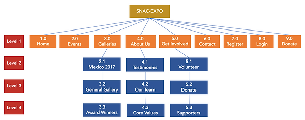
CARD SORTING FOR SETTING THE NEW NAVIGATION
We did an open Card Sorting process among some users to determine the items for the primary navigation and hence helping us to remove certain items from the menu and simplify it.


NEW INFORMATION ARCHITECTURE ORGANIZATION
A new navigation scheme was proposed eliminating one sub-level and two primary levels. These are all straight forward navigation items which are a simplified version of the old menu as per the requirements.

Dissecting the Existing Interface

WHAT DOES THE INTERFACE CONVEY?
Events pages had their shortcomings which were analyzed before starting to sketch the wireframes.
Each of the main interfaces was analyzed to find the missing features and the flaws that it has in the first place. Comments were made both on the visual aspects and also on the logical content flow. It seemed that the homepage was designed and developed in a way that it did not reveal the major intent of the website and the process behind it.
Wireframing the Sample Interfaces

EVENT PAGE DISPLAYING ITINERARY OF THE TOUR

DASHBOARD DISPLAYING DIFFERENT STATS

VOTING AND SUBMISSION PROCESS
The Transformation

HOMEPAGE TRANSFORMATION
Eliminated the boring slideshow content on the homepage into a single static image which has specific call-to-action behavior.
Simplified the complex menu with redundant navigation items into a simple menu with the Magic number in mind.

More pronounced Call to Action Buttons to reach the goal with ease
Increasing the size of the typography for accessibility and also a language translation filter to enable artist around the globe to submit their work without chaos
NEW HOMEPAGE


EVENT PAGE TRANSFORMATION
The Event page is a core page of the website. This page gives the details about the events which happened in the past, the future events and submission of art works at the events.
The Event page also has to reflect past artworks submitted at the events and hence a gallery of images showcasing the submission is needed.
An Event can be a painting or sculpture or a mixed media art. Therefore the necessity of conveying in short about the type of the event is inevitable and saves the efforts of wrong submissions.
Giving the user the flexibility to add the event to the calendar is necessary and also is important the call to action buttons for vote and submit which opens into a whole different set of actions. These CTA's prompt the user to get to a different process without necessarily knowing about the event. This is helpful in scenarios where the artists know the details of the event and hence wish to proceed to the voting/submission process on the first go.
The new design Organizes the Events into upcoming, ongoing and past events. Information is provided about an event avoiding further clickthroughs making the navigation easier.


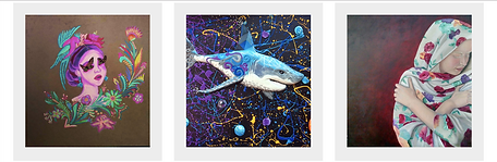
GALLERY PAGE TRANSFORMATION
Infinite scrolling of the artworks removed by including a CTA to explore limited artworks at a time.
Each artwork carries an info about the author, medium used along with the year of the work.
The card layout which included only the image and reveals the description on hover is elevated in the new design with the required information brief removing the hover action.


San Antonio Community Organization
A project where I volunteered to design and develop a Content Management Website for helping the fewer income people file their taxes.
DashBoard
Wireframing
Development
Redesign
TAX FILING VOLUNTEER ORGANIZATION
The San Antonio Community Development Corporation (SACDC), was incorporated on July 9, 1980 as a nonprofit organization. The membership is comprised of small business owners, professional residents, and community oriented person who live or own businesses in the San Antonio District.
THE PROJECT AND THE CHALLENGES
The main aim of this project was to create a website about the organization and its service to the people. The MVP for the creation of the site was simple. Simona, the Compliance officer of the site wanted the site to be crisp and to convey basic information about the organization and what it does to the society. The challenge was to put forth the few contents which we had into a full-fledged website.
USER STORIES
As a compliance officer for the organization, I want more people to get benefitted and know about the organization and the services which we provide.
As a user, I would like to know about the procedure to file taxes and the way to approach the organization.
Catherine, A low-income user
Simona, Compliance Officer
FINAL DESIGN


Child and Family Connections
A project where I volunteered to re-design the Donation Page with more options for the client
DashBoard
Wireframing
Development
Redesign
ORGANIZATION TO CARE FOR THE CHILDREN
THE OBSELETE INTERFACE
Child & Family Connections (CFC) is the first and only peer-run organization in the United States focused exclusively on helping families living with parental mental illness.The goal of the project is to redesign the existing CFC website and include more elements to make it look appealing and also add extra functionalities.

THE RE-BORN INTERFACE WITH NEW DESIGN

DESIGN OF THE DONATION PAGE
The existing site has “Donate” in the navigation bar which opens into Paypal and any donation takes place through the third party vendor. The Founder of the organization wanted to have a stand alone donation page for the website where the user can select the amount to be donated, make recurring payments and can use different payment methods for the purchase.
MY CONTRIBUTIONS
Identified the flaws on the website
Re-designed the Donation Page
Wireframed the Donation Page
THE CHANGES INCORPORATED
New feature added to prompt the user to select the amount to be donated.
Levels of sponsorship are laid out to give a clear perspective of the donation amount
Change
Personal and Additional Information is laid out which was not existing on the older design. These sections are split into steps in the live page to avoid overwhelming information
Information about other forms of donation are also laid with ability to share the info